Second-guessing your brand personality? Take the 60-second Brand Quiz

Branding and web design for Emilia Massage Studio that’s all about relaxation, natural ingredients and deep human connection.
Features on this website:
motd designed by new website design

Calming, relaxing, natural and organic. Those are the words that represent Emilia Studio’s brand.
The owner, Emilia, puts a lot of effort into choosing only the best cosmetics with organic ingredients to use for her treatments. She sources organic mud, from her hometown in Poland and only uses the best cosmetics from the best SPA’s from all over the country.
It was very important for her to send the right message through her branding and website. Natural ingredients, being close to nature, forming deep connections with her patiens – those are the pilars of her brand.
Emilia came to me with a raw idea for her business, without a clue what her branding or website should look like.
She only knew she loved massage, working with people and wants her brand to promote natural ingredients.
I guided her through the Discovery Process, helped her work out her ideal client, brand values and content strategy for her website.
Keep reading to see the end result!


I had only a rough idea for my business and didn’t know how to even begin to create a brand. Alex’s Discovery Process helped me understand who my ideal customer is and what I want my business to represent.
She created a brand and website that speaks the soul of my business and gave me the tools to easily book clients and give them the best experience possible.
I am thrilled with the result and can’t wait to conquer the world!
Organic ingredients, deep connection to nature, calming and relaxing.
This brand falls under Autumn Branding Personality. To capture the soul of Emilia Massage Studio, I used olive green, greys, nude shades and wood textures. Fonts are sans serif and round, shapes are oval and strokes are even weight throughout.
I used brush strokes to refer to the spa brush and natural cosmetics used for treatments.

Mobile friendly
Emilia’s website is fully responsive and works great on tablets and mobiles. She doesn’t have to worry about her patients not being able to book a massage or access her calendar. It all works great!

Easy bookings included
When you sell services and every minute counts, it’s important to make sure the system you’re using is easy both for you and your clients. You don’t want to book multiple clients at the same time and when you take vacation, you want it to be easy to block people from being able to book.
Emilia has the whole system set up, so she can confidently take bookings, payments and she’s sure it’s all in her calendar.
Each service explained
Each treatment has it’s own separate page, explaining everything patient has to know to make a decision and allowing easy booking.
Emilia can add videos, additional images, talk about all the contradictions and explain how the treatment is performed.

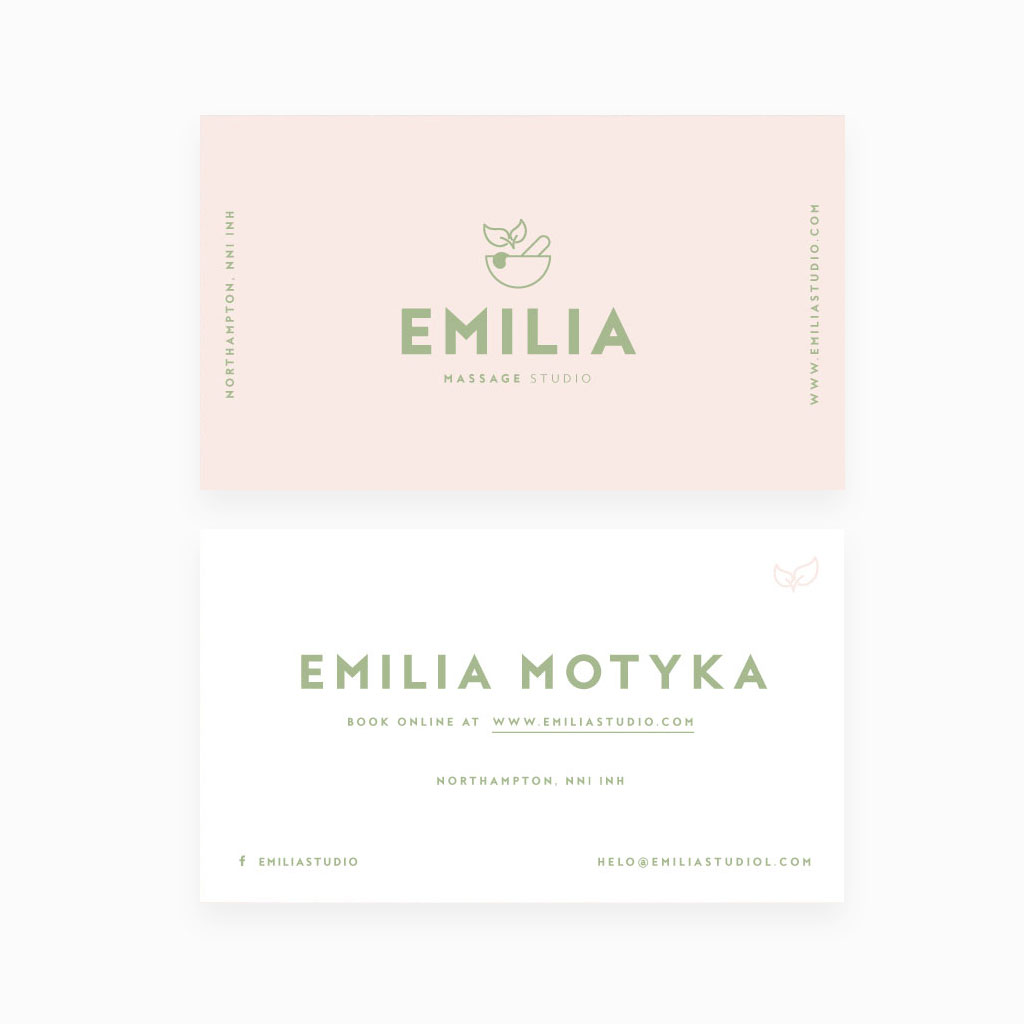
Beautiful stationery to WOW clients every time they are in contact with Emilia’s brand

Personalised gift card for luxury treatments
Emilia can now sell gift treatments to her patients, so that they can give someone they love a luxurious experience. All packaged in style.
A follow up, to show them she cares

Professional e-mail reminders and follow-ups
Emilia needed a professional way to communicate with her clients: confirm appointments, educate her patients on how to prepare for their treatments and follow up with them after the treatment, asking about how they are feeling.
Every detail is important and has to be cohesive, so your brand continuesly WOWs, and you can impress people with your professionalism. That’s why all Emilia’s emails are on brand, designed specifically for her and all set up, so she doesn’t need to worry about anything,

Ready to build a brand and website your business deserves?


0 Comments