Second-guessing your brand personality? Take the 60-second Brand Quiz
Now that you know basics of Color Psychology and learned about Spring Season Personality, let’s talk about Summer.
If Spring wasn’t your jam, maybe Summer will be?
Summer color personality is all about timeless beauty, elegance and romanticism. These people are chic and graceful, with a strong sense of responsibility, well organised.
With their timeless aesthetic, creativity, intuitivity and strong sense of empathy they make perfect wedding planners, photographers, jewellery and fashion designers, classical musicians. They tend to be a bit reserved and distanced.
Summer is far less energetic and much more organised than Spring. We’re coming into the heaty, lazy summer days, that need to be cooled down by muted greys, blues and purples.
Summer Color Palette
Think lazy summer days by the beach. Colors are cool, subtle, muted and elegant. No extremes here! Choose from cool grey and beige, muted blue and purple, pale pink and yellow. Often found are shades of navy blue and dark, pale purple.
Find images that have dreamy feel to them, delicate sunny spells and muted colors.
Textures and patterns
Watercolor & floral textures, delicate floral drawings (using changing line weight), brush strokes. Patterns are geometric and symmetrical.
If you’re looking for perfect images for your brand in Summer personality, look for cool colors, dreamy feel and avoid high contrast.
Quality is absolutely essential to Summer personality, so look for anything that looks expensive, elegant and timeless.
Fonts
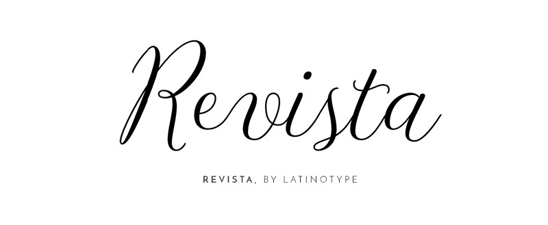
Summer is elegant and celebrates timeless beauty, therefore perfect will be Serif fonts in fine weight. Very common is also using quite a big letter spacing, to make the font look more elegant. Use it wisely though, it’s only to be used as an accent.
Pick fonts like:
Lines and shapes
Summer is delicate, timeless and elegant, therefore the best shapes to capture that, are those rectangular and triangular. Use fine lines, avoid anything that’s bold.
You can freely use lines with changing weight, which will fit perfectly with serif fonts. Think: hard edges, triangles, rectangles, fine lines.


Thanks for this post and particularly the Pinterest board. I have been researching colour psychology for my branding project and understand it in theory but was struggling to visualise the colours so your examples are really helpful. Thanks!
Hi, Lauren! We’re so glad to hear that! Don’t forget to share branding you created!